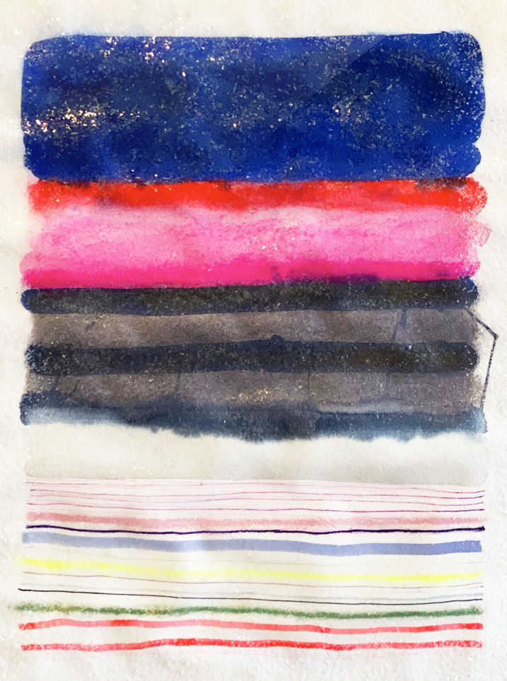
In this series, the color spectrum is my musical scale and paintings are my songs. I’ve always connected to the worlds of color and music. From childhood, hues flashed to me like sparks: the blue of summer sky against a ripple of darker blue water, or a shiny ROYGBIV beetle on top of matte textured bark. Music moved me much the same way—be it a symphony’s crescendo, an intensely emotional ballad, or even the sugar-coated beat of a pop song. Like a mix master, my aim is to evoke the musical within my visual practice by layering colors and textures to create harmonious combinations. Music and visual art have the power to evoke different emotions depending on their composition.
My favorite approach is to light up a canvas with vibrant brights and unexpected tone combinations. Neons juxtapose with faded neutrals; pastels provide a counterpoint to primaries; darker tones live alongside the saturated. The rules of the color wheel are thrown out the window. As it is in the aural realm, anything is possible when employing visual vocabulary unfettered; as long as it brings a zing of joy, the choice is right. And crucially, I listen patiently for inspiration: schemes come instinctively, welling up from my technicolor soul and creating worlds of magic. ‘Chromatic Harmony’ is created with mixed media on rice paper and then mounted to acrylic or iridescent acrylic and coated with layers of acrylic and/or resin and cut glass glitter.
My favorite approach is to light up a canvas with vibrant brights and unexpected tone combinations. Neons juxtapose with faded neutrals; pastels provide a counterpoint to primaries; darker tones live alongside the saturated. The rules of the color wheel are thrown out the window. As it is in the aural realm, anything is possible when employing visual vocabulary unfettered; as long as it brings a zing of joy, the choice is right. And crucially, I listen patiently for inspiration: schemes come instinctively, welling up from my technicolor soul and creating worlds of magic. ‘Chromatic Harmony’ is created with mixed media on rice paper and then mounted to acrylic or iridescent acrylic and coated with layers of acrylic and/or resin and cut glass glitter.


